Cool stuff and UX resources
Introduction
Do you ever find yourself at a loss for words?
Perhaps you said something like "could you bring me that thingamabob over there?"
If we don't know the right words, we fumble around talking about layouts with comments like "it's too loose" or "could you clean that up" or even "what were you trying to do?"
Many of our readers who have taken HFI's Science and Art of Effective Web and Application Design course have heard the principles of "gestalt" as applied to layout. As an HFI instructor I was very pleased and impressed when Phil Goddard updated this course in 2004 with a module on gestalt principles.
Recently, I found a 2002 paper that covered this topic in a systematic fashion.
The paper reminds us that indeed there IS a vocabulary for discussing layouts that are simple, compelling, and "naturally attractive".
Let's see how to talk about layout. Your professional vocabulary sets you apart and makes you a valuable expert on things no-one else knows.
First, we can say "naturally attractive" because Gestalt psychology was all about nature's design of the brain for visual perception.
Back in the 1930s perceptual psychologists asked the question, how does the untrained mind make visual sense of the jumble of colors, lines, and shapes that we see?
The Gestalt research showed that the mind seeks to see "wholeness" or the "Gestalt" (German: Gestalt – "essence or shape of an entity's complete form.")
From Wikipedia: "...the operational principle of Gestalt is that the brain is holistic, parallel, and analog, with self-organizing tendencies. The Gestalt effect is the form-generating capability of our senses, particularly with respect to the visual recognition of figures and whole forms instead of just a collection of simple lines and curves... The phrase 'The whole is greater than the sum of the parts' is often used when explaining Gestalt theory."
Our three authors, Chang, Dooley, and Tuvinen from Australia combed the Gestalt literature and found eleven Gestalt principles applicable to computer screen layouts. They applied the principles to a re-design of an educational application.
They had twelve participants rate the before/after layouts and got confirmation that the eleven Gestalt principles accomplished the job.
Let's see examples of each of their eleven laws of Gestalt from their instructional web site. Decide if you agree with their examples of the Laws of Gestalt.

Five laws of gestalt in the HFI module
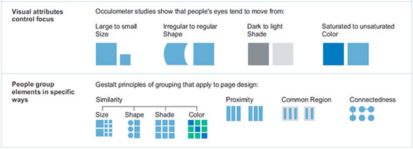
The Quick Review summary handed out in the HFI design course shows five out of the eleven Gestalt laws presented by our three authors. Let's define them, below.
1. Law of Focal Point (Visual attributes that control focus)
The article points out that the focal point "catches the viewer's attention and persuades the viewer to follow the visual message further." For example, to capture your reader's attention, use one of the methods given in the HFI illustration above: "Visual attributes control focus".
Draw attention with something large, or irregular, or dark, or with a saturated color. Of course all of these "starter" shapes must stand out from the other elements on your page.
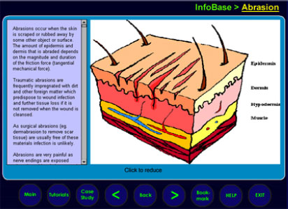
Our authors illustrated this law with a large scale graphic:
2. Law of Similarity
Both HFI and the authors cite the notion that "similar objects will be counted as the same group." In this example below, do you agree that viewers will feel all the circular controls are part of the same group? Instead of nine circles distracting attention, we see one group.
3. Law of Proximity
The authors state "items placed near each other appear to be a group." We see this in the HFI graphic above.
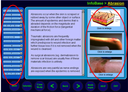
The illustration below shows circles around the elements that are grouped through the gestalt law of proximity. On the left, 14 menu items get perceived as "one" group. On the right, three pictures get perceived as "one" group, as well.
Such techniques simplify mental processing and fulfill the criterion of "processing fluency." See my December, 2009 UI Design Newsletter "User Experience" meets "Beauty is Truth, Truth is Beauty" for discussion of how gestalt principles support rapid assimilation of information.
4. Law of Common Region (Law of "Prägnanz ('Good Form')")
Simply put, "Good Form" arises from a collection of visual elements when the layout supports the feeling of "simplicity." HFI uses the phrase "Common Region" to describe one method of creating good form.
The German word for "good form" is "Prägnanz" – a word you might hear in graphic arts circles. When you want to impress your audience, and you won't embarrass yourself with faulty German pronunciation, see how it goes over. Be sure to define it, however.
In the illustration below, the brackets on both sides of the Lock button create a "good form" that triggers perception of the three circles as one unit. The mind simplifies the collection of three circles by perceiving the brackets as "enclosure". From there, we further process this as a single backward/forward "tool set".
5. Law of Connectedness ("Law of Unity/Harmony")
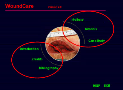
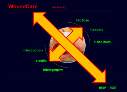
Another technique of grouping involves connecting the elements with some graphic element.The HFI illustration shows a line between items. The authors indicate that their Home Page associates the 6 menu links through the convention of two nearby curved lines.
In both cases, as the authors cite: "Unity implies that a congruity or arrangement exists among the elements in a design; they look as though they belong together, as though there is some visual connection beyond mere chance that has caused them to come together."



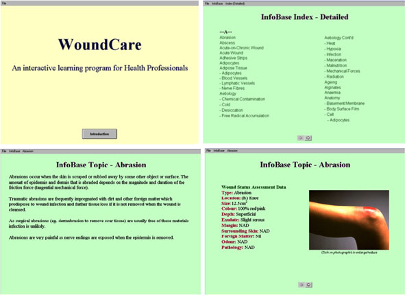
Six more laws of gestalt added by our authors
6. Law of Balance/Symmetry
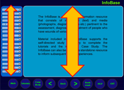
What is the strongest "feel good" element of layout? Our authors indicated "A visual object will appear incomplete if the visual object is not balanced or symmetrical".
Even automated methods of assessing quality of web page designs include measures of symmetry, balance, and equilibrium. See my November, 2010 article "Visionary Usability: Making Friends With Graphic Design" for details.
Below, see how both the left/right axis and top/down axis manifest symmetry and balance. Does that symmetry make this home page feel or appear "complete"? I think so.
7. Law of Continuation
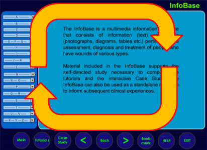
The other laws of Gestalt might be considered "static" in contrast to the Law of Continuation, which supports "the eye's instinctive action to follow a direction derived from the visual field."
This approach to simplification entails supporting the natural viewing pattern according to one's cultural background. European languages get read left to right, top down. Arabic and Hebrew are read right to left.
For textual content, we find that reading habits represent the instinctual "continuity" that ties together screen elements. However, the design must support that pattern of reading.
Thus, we have menus on the left that establish the start point of screen reading. Menus reveal the topic through the highlighted menu option. The page name at the top of the content section reinforces that topic as well.
Upon completing the reading task, the viewer scans the bottom elements to see what actions can be taken. Whatever the action is, the viewer resumes interaction by examining the menu on the left. This is all fairly automatic.
8. Law of Closure
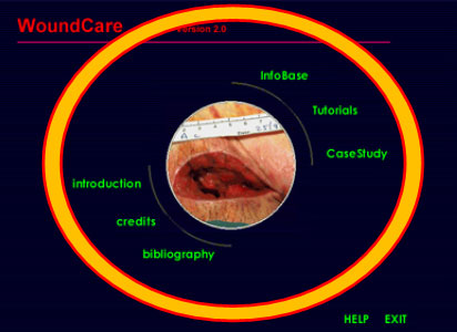
Similar to the Law of Unity/Harmony, the Law of Closure deals with our desire for "completeness" in a visual experience. However, the Law of Closure brings emphasis to the fact that "our minds will tend to close gaps and complete unfinished forms."
The authors offer evidence in the form of their home page design. The circular motif of the center image plus the six menu options brings "closure" to the work of visual examination.
9. Law of Figure-Ground
What portion of your web layout is "figure" (foreground) and what is "ground" (background)? Choices of color, size, and embeddedness of visual elements all contribute to sense-making.
The Law of Figure-Ground captures the psychological fact that we need to determine what is important (figure) and what is secondary (ground).
Here, the figure (foreground) has lighter blue than the ground (background). This becomes a motif for the entire application. Light blue means "look here first".
10. Law of Isomorphic Correspondence
Our authors write "All images do not have the same meaning to us, because we interpret their meanings based on our experiences."
We see the truth of this statement in the case of the three buttons below. How do we understand this configuration? How do we know what they offer for interaction?
The answer comes from the Law of Isomorphic Correspondence. These buttons mimic the play-back controls for digital or analog devices. Or do they?
We might wonder what "Lock" does. Have we seen the word "Lock" on other devices? Perhaps not. But we have seen the playback icon as well as the record icon between two brackets.
That may be good enough to create an isomorphic correspondence with such devices.
11. Law of Simplicity
This law makes the observation that viewers make "an unconscious effort to simplify what is perceived into what the viewer can understand." In a sense, this appears to be a catch-all that subsumes the other ten laws of Gestalt already covered.
The Law of Simplicity addresses the question "But is it simple to use or view or understand?"
The authors suggest that observation of this law by the layout designer allows the viewer to reap the benefits.
As evidence of success, the authors offer these illustrations of their original instructional module. We leave it to you to determine if the Law of Simplicity triumphed in the redesign shown above.
Testing the whole gestalt
In a sense, any time you conduct a usability test, you get feedback on how well your design captures these Laws of Gestalt.
Can users find the right navigational options? Well, they are trying to obey the Law of Simplicity by looking where they expect navigation to appear.
Did you predict those expectations?
- You might have predicted where people look by following "best practices" emulated by other sites in your genre. (Law of Isomorphic Correspondence)
- Your design standards could maintain consistent places to look for navigation. The standard would have specified top level, second level, tertiary level, etc. navigation practices. (Law of Figure-Ground, Law of Continuation)
- Within these standards you could have supported user expectation with proximity of content elements – content gets grouped. (Laws of Proximity, Similarity, Closure)
- You could create focal points for navigation. HFI suggests that "dark areas" can support drawing attention to navigational areas at the top or left side of your layout. (Law of Focal Point)
Let us know how your updated, Gestalt-enriched vocabulary works for you.
And, remember, don't say Prägnanz unless you practice the pronunciation and get the Gestalt of it all.
In some cases "thingamabob" might be just the right thing to say.
References
Chang, D., Dooley, L. and Tuovinen, J.E. (2002). Gestalt Theory in Visual Screen Design - A New Look at an Old Subject. In Proceedings WCCE2001 Australian Topics: Selected Papers from the Seventh World Conference on Computers in Education, Copenhagen, Denmark. CRPIT, 8. McDougall, A., Murnane, J. and Chambers, D., Eds. ACS. 5-12.
Chang, Dempsey; Wilson, Cambell and Dooley, Laurence (2004). Towards Criteria for Visual Layout of Instructional Multimedia Interfaces. Journal of Educational Technology Systems, 32(1), pp. 3-29.
Message from the CEO, Dr. Eric Schaffer — The Pragmatic Ergonomist
Leave a comment here
Reader comments
Sam Ingersoll
q2Results
What do you think though about conversion design which suggests that many elements on websites like "privacy/security icons" and customer logos, etc...are important to include since they provide "in passing" visual clues that the owner, in this case, respects their privacy and is credible. I think many elements, but grouped correctly, is the answer. But I've seen plenty of cluttered sites including shopping carts that convert very well.
Sorin Stefan
Thank you for this article. Bookmarked...
I have a couple of questions:
1. You said occulometer studies shows that people's eyes move from dark shade to light shade and saturated to unsaturated colors. I think this happens when enough contrast is being provided in order for these "dark shades" and "saturated colors" to stand out. Without contrast it wouldn't be any "dark..." or "saturated..." What do you think?
2. Is Law of Common Region (Law of "Prägnanz ('Good Form')") like the Framing technique used in photography? It seems to me that way ... that said it feels like The rule of thirds has some subtle influence on the web also.
What do you think?
David Clark
Excellent! As someone with a deep background in Gestalt theory, therapy, and most recently, teaching Psychology to college students, I appreciate seeing these principles summarized and applied to Web design! Thanks!
T S S Ganesan,
Cognizant
Very nice article. Got to know more on the Gestalt principles. The examples were very helpful. Has driven me to know more of same.
Justin Calingasan,
Sulit.com.ph
Really minor comment here: the graphic you mentioned indicating the text "Lock" actually says "Back". But overall the Gestalt principle has got me hooked. Will read more on this and hopefully apply it in the workflow. It did actually reinforce certain concepts in my mind that have, up until now, have remained nameless.
James
Great article, I really enjoyed it. One point though: I'm sure it's a "back" button and not a "lock" button. What do you think?
Subscribe
Sign up to get our Newsletter delivered straight to your inbox

