- About us
- Contact us: +1.641.472.4480, hfi@humanfactors.com
Cool stuff and UX resources
Introduction
Have you ever tried to read a paper that someone else highlighted? If you have, you know that it is not an easy thing to do. Different people read (and highlight) toward different goals. Even so, it is hard to resist being drawn toward text that has – for better or worse – already been rendered bright yellow.
In their 1997 paper, Silvers and Kreiner documented the pernicious effects of inappropriate highlighting. They compared comprehension scores for students reading un-highlighted and inappropriately highlighted text. Not surprisingly, they found that working through inappropriately highlighted text resulted in lower reading comprehension scores. In addition, they found that prior knowledge didn't help. Students who were warned to ignore the highlighting scored no better than those who were not warned. This has serious implications for used textbook buyers. It also has implications for Web page designers.

The message received also depends on the receiver
Web pages are designed to convey a message. Message receivers face a fairly complicated task. They must filter out the meaningless content in the visual presentation, identify the meaningful content, recognize its patterns, interpret and encode it. The effectiveness of this process can be influenced by receiver characteristics such as age and familiarity with the content. It may also be affected by information processing constraints such as attentional focus and memory limitations.
On the Web, as in other presentation channels, there are two components to a message:
- the message itself, and
- how it is presented.
Seemingly mundane points of content presentation can have influence on how effectively a document (online or otherwise) conveys its message. For instance, using typographic details (such as San Serif fonts for headings and Serif fonts in the body) to help readers recognize the organizational elements of a document, reportedly correlates positively with overall funding scores for peer-reviewed grant proposals (Berlant, 2000). Interestingly, these effects can arise well before any content actually needs interpreting. Legibility effects actually begin at the physiological/ transductive level in the eye: work by Rubinstein and Ulichney suggests that the type faces Helvetica and Times are easier to read than Courier because the frequency of the vertical strokes in those fonts matches the sensitivity of the visual system. (Rubinstein, 1988)
The idea that well-crafted content facilitates message transfer should not be surprising. Presenting well-labeled headings offers readers a roadmap with which to navigate your content. Offering organized, meaningful chunks helps them to map your content with what they already know, facilitating both the interpretation and encoding of your message.
Optimizing presentation in search and compare environments
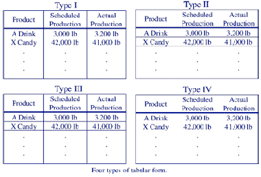
Wu and Yuan (2003) present a study designed to demonstrate that presentation details can facilitate message transmission in data rich environments. Specifically, they evaluated the effectiveness of various table presentations when participants are tasked with identifying and comparing information within a table. Their study explored both the utility of gridlines in table presentation, and the effectiveness of different approaches to highlighting critical information within the table.
Within the gridline condition, they compared:
- tables with column gridlines,
- tables with row gridlines,
- tables with both column and row gridlines, and
- tables with no grid lines.
These different presentation styles are shown in the following figure.
Within the highlighting condition, they compared various approaches to highlighting key data, including:
- blinking key data,
- reverse video,
- colored (red) text, and
- single colored displays (no highlight control).
Participants in this study were asked to scan the tables to identify cases in which there was a discrepancy between data presented across two columns in the same row.
Within the gridline comparison, they found participants were roughly 25% faster in comparing target data pairs in tables that had either no gridlines or had both row and column grids. In contrast, participants were slowed when they were examining data in tables with just row or just column gridlines.
Highlighting had an even greater impact. Participants were significantly faster at identifying exceptional cases when they were highlighted compared with when the same case were presented without highlighting. In some comparisons this improvement was greater than 50%. Blinking and reverse text helped participants focus in on the critical data. Participants proved numerically (but not significantly) fastest at identifying exceptional cases when they were simply highlighted with a different text color – in this case red.
Though not presented in the paper, one explanation I see for the reported differences could be that the participants' task fundamentally changes between the no highlight (control) condition to the highlight conditions.
Think about the functional allocation of the sub-tasks that make up the task. In each trial, the basic process is:
1. Read the value in column A (and remember it)
2. Read the value in column B of the same row (and remember it)
3. Decide if Value A = Value B
4a. If yes, go to next row
4b. If no, record the value
In the control condition the human has to execute each of those steps. In the highlight condition, the computer (by way of the designer's highlights) executes steps 1-4a. The participants task flow changes to:
- Scan for the exception
- Record the value
The simple step of using type face appropriately removes steps 1-3 from the human's sub-task set.
So, by providing visually guiding highlights, the designer essentially shifts the functional allocation of the task. The part of the task that is harder for the human (find and compare) is shifted from the human to the computer. By allocating the functions appropriately, the task becomes easier for the participant. It is completed more quickly. It is also likely to be executed with fewer errors – although this is not discussed in the results section of the paper.
Independent of the analysis, Wu and Yuan (2003) demonstrate that the visual presentation level can influence the speed with which users can scan and interpret tabular data.
The ROI of attention to detail
Have you ever stared at a Web page that was just tiring to look at (much less to read)? Unfortunately, Web and information designers often underestimate the impact of "background" visual details, such as gridlines in tables. As a result, they fail to exploit the visual hierarchy created by detailed design. Or worse, they create visual chaos with it. The cost of this failure to guide their receiver's attention through the message space can add up quickly.
Consider the differences reported by Wu and Yuan. Effective tabular presentation saved slightly over two seconds per table. Appropriate functional allocation saved roughly five seconds per screen. Tullis (1983) reported that employees at a single insurance company view over 4.8 million screens per year. Galitz (1980) reported that Bell system employees, using only one software package, extract information from over 344 million displays within the same period. Given these numbers, a savings of only a few seconds in processing time per display could lead to enormous time and cost savings over the long run.
More on basic typography
Kahn, P. and Lenk, K. (1998). Principles of Typography for User Interface Design. Interactions, November-December. pp 15-29.
Rubinstein, R. (1988) Digital Typography: An Introduction to Type and Composition for Computer System Design, Addison-Wesley.
Savio, N., Web Typography Tutorial, WebMonkey.
References
Berlant, W. (2002) Does typography affect overall proposal assessment. Communications of the ACM, 43(8), pp. 24-25.
Galitz, W. (1980) in: Proceedings of the Life Office Management Association on Human Factors in Office Automation, Atlanta, 1980.
Rubinstein, R. (1988) Digital Typography: An Introduction to Type and Composition for Computer System Design, Addison-Wesley.
Silvers, V.L. and Kreiner, D.S. (1997). The Effects of Pre-Existing Inappropriate Highlighting on Reading Comprehension. Reading Research and Instruction, 36(3), pp. 217-23.
Tullis, T. (1983) The formatting of alphanumeric displays: a review and analysis, Human Factors 25, pp. 657-682.
Wu, J. and Yuan, Y. (2003) Improving searching and reading performance: the effect of highlighting and text color coding Information & Management, 40, pp. 617–637.
Message from the CEO, Dr. Eric Schaffer — The Pragmatic Ergonomist

Good usability engineers look at the high-level structure of a page. They shape the user's understanding with cues about the hierarchy, relationship, and criticality of data. To this end we add headers, highlighting, font changes, and other powerful cues. These can be very effective. But this newsletter gives us a caution. Sloppy or poorly chosen cues are WORSE than no cues at all. So we have convincing evidence that poorly conceived and gratuitous cues will impair the user's performance.
Leave a comment here
Subscribe
Sign up to get our Newsletter delivered straight to your inbox
Privacy policy
Reviewed: 18 Mar 2014
This Privacy Policy governs the manner in which Human Factors International, Inc., an Iowa corporation (“HFI”) collects, uses, maintains and discloses information collected from users (each, a “User”) of its humanfactors.com website and any derivative or affiliated websites on which this Privacy Policy is posted (collectively, the “Website”). HFI reserves the right, at its discretion, to change, modify, add or remove portions of this Privacy Policy at any time by posting such changes to this page. You understand that you have the affirmative obligation to check this Privacy Policy periodically for changes, and you hereby agree to periodically review this Privacy Policy for such changes. The continued use of the Website following the posting of changes to this Privacy Policy constitutes an acceptance of those changes.
Cookies
HFI may use “cookies” or “web beacons” to track how Users use the Website. A cookie is a piece of software that a web server can store on Users’ PCs and use to identify Users should they visit the Website again. Users may adjust their web browser software if they do not wish to accept cookies. To withdraw your consent after accepting a cookie, delete the cookie from your computer.
Privacy
HFI believes that every User should know how it utilizes the information collected from Users. The Website is not directed at children under 13 years of age, and HFI does not knowingly collect personally identifiable information from children under 13 years of age online. Please note that the Website may contain links to other websites. These linked sites may not be operated or controlled by HFI. HFI is not responsible for the privacy practices of these or any other websites, and you access these websites entirely at your own risk. HFI recommends that you review the privacy practices of any other websites that you choose to visit.
HFI is based, and this website is hosted, in the United States of America. If User is from the European Union or other regions of the world with laws governing data collection and use that may differ from U.S. law and User is registering an account on the Website, visiting the Website, purchasing products or services from HFI or the Website, or otherwise using the Website, please note that any personally identifiable information that User provides to HFI will be transferred to the United States. Any such personally identifiable information provided will be processed and stored in the United States by HFI or a service provider acting on its behalf. By providing your personally identifiable information, User hereby specifically and expressly consents to such transfer and processing and the uses and disclosures set forth herein.
In the course of its business, HFI may perform expert reviews, usability testing, and other consulting work where personal privacy is a concern. HFI believes in the importance of protecting personal information, and may use measures to provide this protection, including, but not limited to, using consent forms for participants or “dummy” test data.
The Information HFI Collects
Users browsing the Website without registering an account or affirmatively providing personally identifiable information to HFI do so anonymously. Otherwise, HFI may collect personally identifiable information from Users in a variety of ways. Personally identifiable information may include, without limitation, (i)contact data (such as a User’s name, mailing and e-mail addresses, and phone number); (ii)demographic data (such as a User’s zip code, age and income); (iii) financial information collected to process purchases made from HFI via the Website or otherwise (such as credit card, debit card or other payment information); (iv) other information requested during the account registration process; and (v) other information requested by our service vendors in order to provide their services. If a User communicates with HFI by e-mail or otherwise, posts messages to any forums, completes online forms, surveys or entries or otherwise interacts with or uses the features on the Website, any information provided in such communications may be collected by HFI. HFI may also collect information about how Users use the Website, for example, by tracking the number of unique views received by the pages of the Website, or the domains and IP addresses from which Users originate. While not all of the information that HFI collects from Users is personally identifiable, it may be associated with personally identifiable information that Users provide HFI through the Website or otherwise. HFI may provide ways that the User can opt out of receiving certain information from HFI. If the User opts out of certain services, User information may still be collected for those services to which the User elects to subscribe. For those elected services, this Privacy Policy will apply.
How HFI Uses Information
HFI may use personally identifiable information collected through the Website for the specific purposes for which the information was collected, to process purchases and sales of products or services offered via the Website if any, to contact Users regarding products and services offered by HFI, its parent, subsidiary and other related companies in order to otherwise to enhance Users’ experience with HFI. HFI may also use information collected through the Website for research regarding the effectiveness of the Website and the business planning, marketing, advertising and sales efforts of HFI. HFI does not sell any User information under any circumstances.
Disclosure of Information
HFI may disclose personally identifiable information collected from Users to its parent, subsidiary and other related companies to use the information for the purposes outlined above, as necessary to provide the services offered by HFI and to provide the Website itself, and for the specific purposes for which the information was collected. HFI may disclose personally identifiable information at the request of law enforcement or governmental agencies or in response to subpoenas, court orders or other legal process, to establish, protect or exercise HFI’s legal or other rights or to defend against a legal claim or as otherwise required or allowed by law. HFI may disclose personally identifiable information in order to protect the rights, property or safety of a User or any other person. HFI may disclose personally identifiable information to investigate or prevent a violation by User of any contractual or other relationship with HFI or the perpetration of any illegal or harmful activity. HFI may also disclose aggregate, anonymous data based on information collected from Users to investors and potential partners. Finally, HFI may disclose or transfer personally identifiable information collected from Users in connection with or in contemplation of a sale of its assets or business or a merger, consolidation or other reorganization of its business.
Personal Information as Provided by User
If a User includes such User’s personally identifiable information as part of the User posting to the Website, such information may be made available to any parties using the Website. HFI does not edit or otherwise remove such information from User information before it is posted on the Website. If a User does not wish to have such User’s personally identifiable information made available in this manner, such User must remove any such information before posting. HFI is not liable for any damages caused or incurred due to personally identifiable information made available in the foregoing manners. For example, a User posts on an HFI-administered forum would be considered Personal Information as provided by User and subject to the terms of this section.
Security of Information
Information about Users that is maintained on HFI’s systems or those of its service providers is protected using industry standard security measures. However, no security measures are perfect or impenetrable, and HFI cannot guarantee that the information submitted to, maintained on or transmitted from its systems will be completely secure. HFI is not responsible for the circumvention of any privacy settings or security measures relating to the Website by any Users or third parties.
Correcting, Updating, Accessing or Removing Personal Information
If a User’s personally identifiable information changes, or if a User no longer desires to receive non-account specific information from HFI, HFI will endeavor to provide a way to correct, update and/or remove that User’s previously-provided personal data. This can be done by emailing a request to HFI at hfi@humanfactors.com. Additionally, you may request access to the personally identifiable information as collected by HFI by sending a request to HFI as set forth above. Please note that in certain circumstances, HFI may not be able to completely remove a User’s information from its systems. For example, HFI may retain a User’s personal information for legitimate business purposes, if it may be necessary to prevent fraud or future abuse, for account recovery purposes, if required by law or as retained in HFI’s data backup systems or cached or archived pages. All retained personally identifiable information will continue to be subject to the terms of the Privacy Policy to which the User has previously agreed.
Contacting HFI
If you have any questions or comments about this Privacy Policy, you may contact HFI via any of the following methods:
Human Factors International, Inc.
PO Box 2020
1680 highway 1, STE 3600
Fairfield IA 52556
hfi@humanfactors.com
(800) 242-4480
Terms and Conditions for Public Training Courses
Reviewed: 18 Mar 2014
Cancellation of Course by HFI
HFI reserves the right to cancel any course up to 14 (fourteen) days prior to the first day of the course. Registrants will be promptly notified and will receive a full refund or be transferred to the equivalent class of their choice within a 12-month period. HFI is not responsible for travel expenses or any costs that may be incurred as a result of cancellations.
Cancellation of Course by Participants (All regions except India)
$100 processing fee if cancelling within two weeks of course start date.
Cancellation / Transfer by Participants (India)
4 Pack + Exam registration: Rs. 10,000 per participant processing fee (to be paid by the participant) if cancelling or transferring the course (4 Pack-CUA/CXA) registration before three weeks from the course start date. No refund or carry forward of the course fees if cancelling or transferring the course registration within three weeks before the course start date.
Cancellation / Transfer by Participants (Online Courses)
$100 processing fee if cancelling within two weeks of course start date. No cancellations or refunds less than two weeks prior to the first course start date.
Individual Modules: Rs. 3,000 per participant ‘per module’ processing fee (to be paid by the participant) if cancelling or transferring the course (any Individual HFI course) registration before three weeks from the course start date. No refund or carry forward of the course fees if cancelling or transferring the course registration within three weeks before the course start date.
Exam: Rs. 3,000 per participant processing fee (to be paid by the participant) if cancelling or transferring the pre agreed CUA/CXA exam date before three weeks from the examination date. No refund or carry forward of the exam fees if requesting/cancelling or transferring the CUA/CXA exam within three weeks before the examination date.
No Recording Permitted
There will be no audio or video recording allowed in class. Students who have any disability that might affect their performance in this class are encouraged to speak with the instructor at the beginning of the class.
Course Materials Copyright
The course and training materials and all other handouts provided by HFI during the course are published, copyrighted works proprietary and owned exclusively by HFI. The course participant does not acquire title nor ownership rights in any of these materials. Further the course participant agrees not to reproduce, modify, and/or convert to electronic format (i.e., softcopy) any of the materials received from or provided by HFI. The materials provided in the class are for the sole use of the class participant. HFI does not provide the materials in electronic format to the participants in public or onsite courses.