- About us
- Contact us: +1.641.472.4480, hfi@humanfactors.com
Cool stuff and UX resources
Introduction
A 2007 surveys indicates that in the United States, visitors found video on 92 of the major 100 newspaper websites.
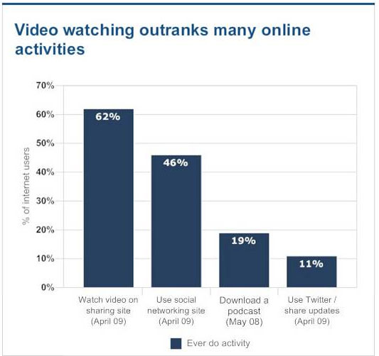
A 2009 Pew Research Center study finds 62% of online adults watch video online, more than the 46% of adults who use social networking sites.
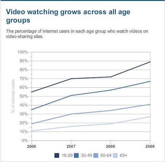
From Pew: "Nine-in-ten internet users ages 18-29 use video-sharing sites, up from 72% one year ago... Online adults ages 30-49 also showed big gains over the past year; 67% now use video-sharing sites, up from 57% in 2008."
Interested? Try this, from Pew: "On a typical day in 2009, 36% of young-adult internet users watched video on these sites, compared with just 30% in 2008."
Given that visitors spend only 25 to 35 seconds on a homepage before navigating, we all might wonder how to make best use of this time when incorporating video into our information-oriented website.
Speaking of information websites, hopefully we see our usability challenges before us:
- intranet (keep employees informed)
- corporate identity sites (keep investors informed)
- internet (keep customers informed)
The "rush to video" has many justifications...
1. "Seeing is believing" provides strong motivation not only for news sites but for our own organizational uses. Video shows people, places, processes, inventions, products, and consumer excitement.
2. "Action captures attention" justifies many movies and TV shows that we might otherwise dismiss as mindless banter. If nothing else, action on the screen mesmerizes viewers into watching the next commercial. (We hope your website offers a LOT more!)
3. "Readers rush to the internet" suggests that the flexibility and ubiquity of Web news (and video) offers greater satisfaction to modern readers. From "Global Perspective: Seeking a New Business Model for Newspapers," by Andria Carter (2009-2010 Society for New Communications Research Fellow):
The success of the internet has taken everyone by surprise. Over 23 percent of the world are communicating or accessing information on the web. The top 50 news websites saw traffic for the year grow by 27 percent, according to the Pew Center. The top four news sites – Yahoo, MSNBC.com, CNN.com, and AOL – saw unique visitors grow 22 percent to 23.6 million visitors a month.

What pitfalls to avoid with video pages?
Given the popularity of video, we may ask what design approaches have graduated to "best practices".
How do these video-related design approaches differ from their cousin-sites: the typical "news site"?
Two university faculty media researchers, William Gibbs and Ronon Bernas, answered these questions using eye-tracking studies of 14 undergraduate students, averaging 23 years old (6 females and 8 males).
They asked...
1) Are TV web pages viewed similarly to newspaper pages? Does visual attention paid to a TV site (CNN, Fox News, MSNBC) differ from visual scan patterns paid to a newspaper site (USA Today, New York Times, Pittsburgh Post Gazette)?
2) What areas of these homepages attract attention? Do these areas differ by TV vs newspaper orientation?
3) Do readers have different "scan paths" for these two types of sites? What elements support or slow down attention? What draws attention? How much difference in attention exists?
Let's examine answers to these questions with an eye to establishing "best practices" for using video on your websites.1. Are TV web pages viewed similarly to newspaper homepages?
The researchers examined several from a number of standard eye scan measures, but found no overall differences in these measures. A "fixation" is a very brief moment (0.1 to 0.3 seconds) when the eye stops to view the text or pictures. A "saccade" occurs when the eye moves from one fixation to the next.
These measures were similar for both TV and video homepages:
1. Number of fixations (about 14 "stops" for both types of sites before clicking a link).
2. Fixation duration (about 0.1 to 0.3 seconds per stop, totaling about 1.1 seconds during the page view).
3. Saccade rate (about 1 "move" per second).
4. Total viewing time (about 13 seconds total per homepage)
Conclusion: overall, this showed that newspaper sites were not more complex or visually demanding than video sites under "free-form browsing tasks."
2. What areas of TV vs news homepages attract attention?
Let's look at the screen areas below. Participants spent an average of 13 seconds of visual attention before clicking a link. They had been told to "browse each news site freely and find a story of interest."
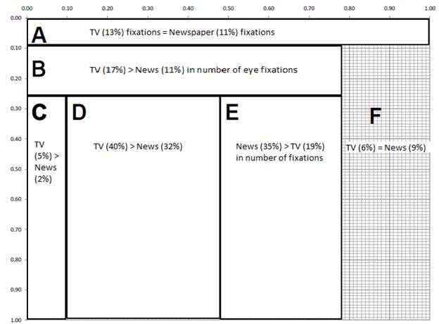
Region A: Browser bar. No differences in fixations.
Collectively, the Browser bar received 40% of first fixations. Participants looked at the top of the screen 40% of the time when opening the web page across both TV and news sites.
The numbers in the figure below refer to percent of total fixations – not first fixations discussed above. TV homepages (with video) received more total fixations for regions B, C and D.
News homepages got more fixations in region E.
Region B: Site branding, header, and navigation. TV got more fixations than newspaper homepages.
Collectively, section B received 20% of first fixations. Combined, regions A and B received 60% of first fixations. This shows the participants used the browser, navigation, and header regions A and B to initially orient their visual searches and navigation.
Other design insights come from research cited by Vadim Lavrusik's thesis (2009). He studied 10 news sites (newspaper and television) in the Minneapolis, Minnesota (USA) market area.
Lavrusik points out that top level navigation can fail to guide viewers to video. He suggests that his sample of 10 sites could do a better job of providing links to videos. He writes:
"Sites such as the Pioneer Press and MPR did not include links to video content in its navigation bar, a poor example of providing useful navigation for viewers. This not only makes it more difficult for users to find video content, but likely contributes to fewer video plays."
Region C: Left-hand navigation column. TV got more fixations than newspaper homepages.
TV sites attracted more attention to regions B, C and D probably because TV sites grouped news story links in one general area (near the video image). Also, as a "best practice" among TV sites, this use of links was more consistent on TV sites than on news sites, thus accentuating the statistical difference.
In a contrasting "best practice" approach, news sites tending to use headlines as the primary navigation links (see below) which were spread over the page, plus placement of link groupings varied more among the newspaper sites. The authors say, "For instance, The New York Times presented news story links in the lower-middle portion of the page, whereas the Post Gazette presented them in the upper-middle."
Region D: Headline news content. TV got more fixations than newspaper homepages.
As given, above, Gibbs and Bernas found that TV sites used a best practice of grouping their headlines more consistently near the video element of their homepage.
Region E: Miscellaneous content and advertisements. News homepages got more fixations than TV homepages.
This gives evidence that on news homepages, participants foraged more widely for news story links in the body of documents rather than site navigational links at the top and left sides of the pages. News sites often use a best practice where text links appear in special categories. The authors report "The New York Times homepage presented lists of links under More News and On the Blogs that were headlines in close proximity to one another in region E".
Lavrusik recommends avoiding placement of video in region E because of how the right column gets used in news sites. He writes:
"A recent eyetracking study that analyzed readers on online newspaper websites showed that the right column of the page, often referred to as the right sidebar, received little fixation from users who were viewing an article page (Zambarbieri, et al, 7) This could be damaging to news sites that include related video with text stories, but include the player in the far right column of the webpage and not within the confines of the story design. This is likely the result of users being used to the right column of a page being used for extra navigation lists ("most popular" box), resources (calendar) and advertisements, instead of being directly tied or related to the immediate content of the article page."
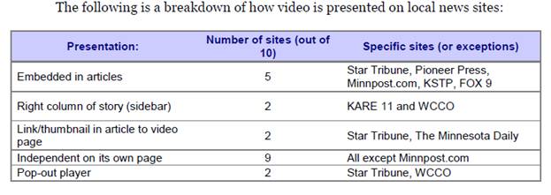
In support of this observation, only 2 out of the 10 websites placed the video in the right column of the page. In contrast, 5 out of the 10 sites preferred to embed videos with associated articles, as given in this table:
3. Do readers have different "scan paths" for these two types of sites?
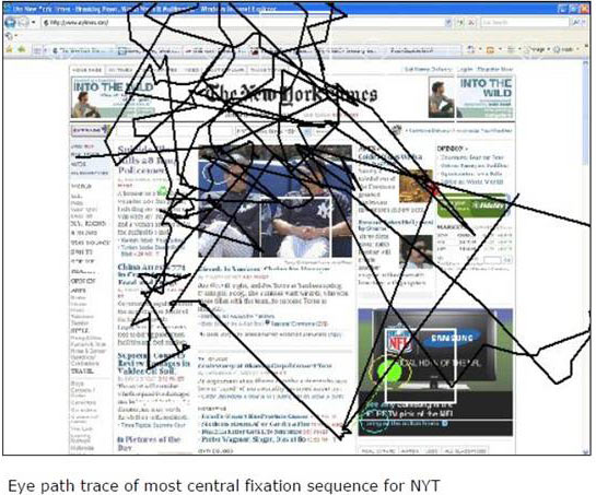
Interestingly, the authors found that a given participant used the same type of "scan path" across the regions for both the TV and the newspaper homepages.
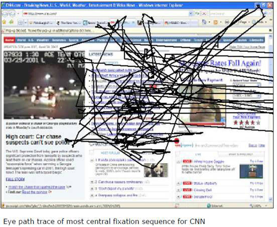
However, when contrasting the TV versus newspaper scan paths, they found that the TV homepages showed a denser, focused clustering of scanning, as in this picture of the CNN homepage. Note that many links occur immediately to the right of the video object.
(Scan paths from the center to the right of the picture show eye glances to the scroll bar.)
The authors comment "When links were concentrated in one general area, as on TV homepages, those areas capture visual attention, perhaps resulting in less scan path variability. Conversely, on the newsprint sites, designs resembled a newspaper with prominent headlines throughout the page, possibly making link groupings less salient and resulting in across-user variability." (See next figure for newspaper eye-scan.)
Lavrusik's study found that 5 out of his sample of 10 news and TV sites embedded video with an article, as illustrated here. This physical proximity creates a natural flow from text to video and supports rapid absorption of the video message.
"A key factor in deciding where to place the video player has been in whether the placement is effective in drawing the viewers' eyes and gets the video watched. At BBC News, for example, 40 percent of videos embedded into stories would be watched, in comparison to the 2 percent when put in a standalone player (Luft)."
Furthermore: "Evidence shows that readers are much more likely to watch videos that are related to a print story. Anderson of Minnpost said that judging by the page views, videos seem to work better on the site when used with a story to enhance the readers' understanding of the subject matter."

Wrapping up the showdown between video and news
The authors conclude that participants adopted different viewing strategies for TV versus newspaper homepages.
The eye-scan differences result from alternative "best practices" used by the respective site designers. Video-oriented web homepages tended to place additional links next to the main object of interest – the video object.
Newspapers, on the other hand, dispersed links among the various headlines across the page and within special groups like "Other Articles of Interest". You have similar choices.
Note that even though newspaper home pages utilized large photographs, there were few eye fixations on those pictures. This reflects results of other research by organizations such as the Stanford Poynter Eye-Scan III project. It may be that viewers pick up the content of those photographs with their "peripheral vision" and thus avoid directly fixating on them.
Here is a summary of your take-aways on the use of video in your website...
1) TV sites tend to place additional links close to the video image. This concentration of links requires less eye movement than used on news sites where articles are spread across the page. Therefore, consider how you can offer similar clusters of links that give your reader greater eye-scan "efficiency" than with newspaper homepages. Consider how you can concentrate links to allow "one-stop shopping" for the next viewing event.
2) Likewise, consider placing videos next to text articles that relate to the videos. Readers can rapidly digest short videos that support the text. For articles about people, readers can use the video to uncover the "personality" otherwise hidden by the textual presentation. This provides greater depth of coverage.
3) Insure that your high-level navigation gives access to your videos, if other means will not expose viewers to the video right away.
4) Be consistent in your placement of elements across your pages. The research found that site visitors tended to use the same scanning pattern across websites. Therefore, end-users expect to find certain things like advertisements, groups of links, articles, videos, and pictures within each region (B, C, D and E) of your pages. Fulfill those expectations.
5) In your newspaper site, reduce scanning variability (and thus added work for the viewer) by grouping links in the upper regions of the page in a consistent manner across pages. Basically, take a page from the playbook of video sites by clustering links near a picture or video above the fold.
6) Insure that the upper regions in both TV and newspaper homepages provide both page orientation and navigational cues. This cues your end-user and reduces wasted eye-scans used in looking for those cues.
7) Initial fixations occurred in the browser bar and in the site branding areas. To make information foraging more efficient, put other links and link groups directly below those areas.
As we know, best practices emerge from the collective experience of many site designers, their managers, and the feedback they receive from thousands of page clicks.
As you transition your audiences to video excitement in your website design, make life easy for them by fulfilling their expectations for "how pages work."References
Gibbs, William J. and Bernas, Ronan, S, 2009. Visual Attention in Newspaper versus TV-Oriented News Websites, Journal of Usability Studies, 4 (4), 146-165.
Lavrusik, Vadim, 2009. Local Online News Video Design and Usability: What's working, what's not Posted 4 August 2009 to online journalism blog. Thesis available at http://lavrusik.com/wp-content/uploads/2009/08/Webthesis.pdf (Getting in-line with online: Has local news video reached 2.0?)
Outing, Steve and Ruel, Laura, The Best of Eyetrack III: What We Saw When We Looked Through Their Eyes Downloaded 30 October, 2010 from www.poynterextra.org/eyetrack2004/main.htm
Poole, Alex and Ball, Linden J, 2005. Eye Tracking in Human-computer Interaction and Usability Research: Current Status and Future Prospects, Chapter in C. Ghaouli (Ed) Encyclopedia of Human-Computer Interaction, Pennsylvania: Idea Group, Inc.
Russell, Mark, 2005. Using Eye-Tracking Data to Understand First Impressions of a Website. SURL: Software Usability Research Laboratory, Wichita State University. Usability News, 7(1).
Message from the CEO, Dr. Eric Schaffer — The Pragmatic Ergonomist
Leave a comment here
Reader comments
Tess Robinson
Go Viral Now
Excellent article. Video needs this sort of research to maximize how and where we use it.
Subscribe
Sign up to get our Newsletter delivered straight to your inbox
Privacy policy
Reviewed: 18 Mar 2014
This Privacy Policy governs the manner in which Human Factors International, Inc., an Iowa corporation (“HFI”) collects, uses, maintains and discloses information collected from users (each, a “User”) of its humanfactors.com website and any derivative or affiliated websites on which this Privacy Policy is posted (collectively, the “Website”). HFI reserves the right, at its discretion, to change, modify, add or remove portions of this Privacy Policy at any time by posting such changes to this page. You understand that you have the affirmative obligation to check this Privacy Policy periodically for changes, and you hereby agree to periodically review this Privacy Policy for such changes. The continued use of the Website following the posting of changes to this Privacy Policy constitutes an acceptance of those changes.
Cookies
HFI may use “cookies” or “web beacons” to track how Users use the Website. A cookie is a piece of software that a web server can store on Users’ PCs and use to identify Users should they visit the Website again. Users may adjust their web browser software if they do not wish to accept cookies. To withdraw your consent after accepting a cookie, delete the cookie from your computer.
Privacy
HFI believes that every User should know how it utilizes the information collected from Users. The Website is not directed at children under 13 years of age, and HFI does not knowingly collect personally identifiable information from children under 13 years of age online. Please note that the Website may contain links to other websites. These linked sites may not be operated or controlled by HFI. HFI is not responsible for the privacy practices of these or any other websites, and you access these websites entirely at your own risk. HFI recommends that you review the privacy practices of any other websites that you choose to visit.
HFI is based, and this website is hosted, in the United States of America. If User is from the European Union or other regions of the world with laws governing data collection and use that may differ from U.S. law and User is registering an account on the Website, visiting the Website, purchasing products or services from HFI or the Website, or otherwise using the Website, please note that any personally identifiable information that User provides to HFI will be transferred to the United States. Any such personally identifiable information provided will be processed and stored in the United States by HFI or a service provider acting on its behalf. By providing your personally identifiable information, User hereby specifically and expressly consents to such transfer and processing and the uses and disclosures set forth herein.
In the course of its business, HFI may perform expert reviews, usability testing, and other consulting work where personal privacy is a concern. HFI believes in the importance of protecting personal information, and may use measures to provide this protection, including, but not limited to, using consent forms for participants or “dummy” test data.
The Information HFI Collects
Users browsing the Website without registering an account or affirmatively providing personally identifiable information to HFI do so anonymously. Otherwise, HFI may collect personally identifiable information from Users in a variety of ways. Personally identifiable information may include, without limitation, (i)contact data (such as a User’s name, mailing and e-mail addresses, and phone number); (ii)demographic data (such as a User’s zip code, age and income); (iii) financial information collected to process purchases made from HFI via the Website or otherwise (such as credit card, debit card or other payment information); (iv) other information requested during the account registration process; and (v) other information requested by our service vendors in order to provide their services. If a User communicates with HFI by e-mail or otherwise, posts messages to any forums, completes online forms, surveys or entries or otherwise interacts with or uses the features on the Website, any information provided in such communications may be collected by HFI. HFI may also collect information about how Users use the Website, for example, by tracking the number of unique views received by the pages of the Website, or the domains and IP addresses from which Users originate. While not all of the information that HFI collects from Users is personally identifiable, it may be associated with personally identifiable information that Users provide HFI through the Website or otherwise. HFI may provide ways that the User can opt out of receiving certain information from HFI. If the User opts out of certain services, User information may still be collected for those services to which the User elects to subscribe. For those elected services, this Privacy Policy will apply.
How HFI Uses Information
HFI may use personally identifiable information collected through the Website for the specific purposes for which the information was collected, to process purchases and sales of products or services offered via the Website if any, to contact Users regarding products and services offered by HFI, its parent, subsidiary and other related companies in order to otherwise to enhance Users’ experience with HFI. HFI may also use information collected through the Website for research regarding the effectiveness of the Website and the business planning, marketing, advertising and sales efforts of HFI. HFI does not sell any User information under any circumstances.
Disclosure of Information
HFI may disclose personally identifiable information collected from Users to its parent, subsidiary and other related companies to use the information for the purposes outlined above, as necessary to provide the services offered by HFI and to provide the Website itself, and for the specific purposes for which the information was collected. HFI may disclose personally identifiable information at the request of law enforcement or governmental agencies or in response to subpoenas, court orders or other legal process, to establish, protect or exercise HFI’s legal or other rights or to defend against a legal claim or as otherwise required or allowed by law. HFI may disclose personally identifiable information in order to protect the rights, property or safety of a User or any other person. HFI may disclose personally identifiable information to investigate or prevent a violation by User of any contractual or other relationship with HFI or the perpetration of any illegal or harmful activity. HFI may also disclose aggregate, anonymous data based on information collected from Users to investors and potential partners. Finally, HFI may disclose or transfer personally identifiable information collected from Users in connection with or in contemplation of a sale of its assets or business or a merger, consolidation or other reorganization of its business.
Personal Information as Provided by User
If a User includes such User’s personally identifiable information as part of the User posting to the Website, such information may be made available to any parties using the Website. HFI does not edit or otherwise remove such information from User information before it is posted on the Website. If a User does not wish to have such User’s personally identifiable information made available in this manner, such User must remove any such information before posting. HFI is not liable for any damages caused or incurred due to personally identifiable information made available in the foregoing manners. For example, a User posts on an HFI-administered forum would be considered Personal Information as provided by User and subject to the terms of this section.
Security of Information
Information about Users that is maintained on HFI’s systems or those of its service providers is protected using industry standard security measures. However, no security measures are perfect or impenetrable, and HFI cannot guarantee that the information submitted to, maintained on or transmitted from its systems will be completely secure. HFI is not responsible for the circumvention of any privacy settings or security measures relating to the Website by any Users or third parties.
Correcting, Updating, Accessing or Removing Personal Information
If a User’s personally identifiable information changes, or if a User no longer desires to receive non-account specific information from HFI, HFI will endeavor to provide a way to correct, update and/or remove that User’s previously-provided personal data. This can be done by emailing a request to HFI at hfi@humanfactors.com. Additionally, you may request access to the personally identifiable information as collected by HFI by sending a request to HFI as set forth above. Please note that in certain circumstances, HFI may not be able to completely remove a User’s information from its systems. For example, HFI may retain a User’s personal information for legitimate business purposes, if it may be necessary to prevent fraud or future abuse, for account recovery purposes, if required by law or as retained in HFI’s data backup systems or cached or archived pages. All retained personally identifiable information will continue to be subject to the terms of the Privacy Policy to which the User has previously agreed.
Contacting HFI
If you have any questions or comments about this Privacy Policy, you may contact HFI via any of the following methods:
Human Factors International, Inc.
PO Box 2020
1680 highway 1, STE 3600
Fairfield IA 52556
hfi@humanfactors.com
(800) 242-4480
Terms and Conditions for Public Training Courses
Reviewed: 18 Mar 2014
Cancellation of Course by HFI
HFI reserves the right to cancel any course up to 14 (fourteen) days prior to the first day of the course. Registrants will be promptly notified and will receive a full refund or be transferred to the equivalent class of their choice within a 12-month period. HFI is not responsible for travel expenses or any costs that may be incurred as a result of cancellations.
Cancellation of Course by Participants (All regions except India)
$100 processing fee if cancelling within two weeks of course start date.
Cancellation / Transfer by Participants (India)
4 Pack + Exam registration: Rs. 10,000 per participant processing fee (to be paid by the participant) if cancelling or transferring the course (4 Pack-CUA/CXA) registration before three weeks from the course start date. No refund or carry forward of the course fees if cancelling or transferring the course registration within three weeks before the course start date.
Cancellation / Transfer by Participants (Online Courses)
$100 processing fee if cancelling within two weeks of course start date. No cancellations or refunds less than two weeks prior to the first course start date.
Individual Modules: Rs. 3,000 per participant ‘per module’ processing fee (to be paid by the participant) if cancelling or transferring the course (any Individual HFI course) registration before three weeks from the course start date. No refund or carry forward of the course fees if cancelling or transferring the course registration within three weeks before the course start date.
Exam: Rs. 3,000 per participant processing fee (to be paid by the participant) if cancelling or transferring the pre agreed CUA/CXA exam date before three weeks from the examination date. No refund or carry forward of the exam fees if requesting/cancelling or transferring the CUA/CXA exam within three weeks before the examination date.
No Recording Permitted
There will be no audio or video recording allowed in class. Students who have any disability that might affect their performance in this class are encouraged to speak with the instructor at the beginning of the class.
Course Materials Copyright
The course and training materials and all other handouts provided by HFI during the course are published, copyrighted works proprietary and owned exclusively by HFI. The course participant does not acquire title nor ownership rights in any of these materials. Further the course participant agrees not to reproduce, modify, and/or convert to electronic format (i.e., softcopy) any of the materials received from or provided by HFI. The materials provided in the class are for the sole use of the class participant. HFI does not provide the materials in electronic format to the participants in public or onsite courses.


