- About us
- Contact us: +1.641.472.4480, hfi@humanfactors.com
Cool stuff and UX resources
Introduction
User experience practitioners understand how important it is to keep up to date on the latest research in our field. We are always on the lookout for ways to put research into practice. Here are our 7 favorite research papers of 2014.
- Safety and Multi-tasking With In-Vehicle Speech Interfaces
- Reminders of Mortality Make Customers Want to Buy
- What five factors most improve search engine ranking?
- Flick Versus Ring Scrolling on Smartphones
- Front-Facing 3D-Board Enhances Remote Collaboration
- How Engaging Are Different On-Screen Website Controls?
- Companies With Better Customer Experiences Have Better Stock Performance
- Safety and Multi-tasking With In-Vehicle Speech Interfaces
- Reminders of Mortality Make Customers Want to Buy
- This was a controlled experiment with random assignment, which is the gold standard for research showing that one thing causes another.
- All of the participants were Dutch, so these results may not generalize to other target audiences.
- The study relied on self-reported ratings of intention to buy rather than recording actual purchasing behavior. It is possible their intention to buy would not translate into actual purchases.
- Although there was a statistically significant effect of reminding people of death on their ratings of purchase intention, the size of the effect seems questionable. The difference between the mean ratings was 0.35 points for study 1, 0.41 points for study 2, and 0.5 points for study 3. This means the effect was at most half of a point on measure using 7-point Likert scales.
- On top of the effect being small, there may be other negative effects of reminding people of their mortality in advertising, such as negative effects on brand image or brand loyalty. Do you want your brand associated with death?
- There may also be ethical considerations, such as the negative psychological impact of fear-based advertising.
- What five factors most improve search engine ranking?
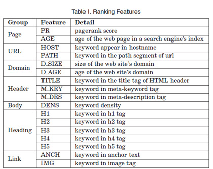
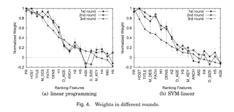
- Search engines ranking results can be predicted with an accuracy of about 80% using linear learning models and a recursive partitioning algorithm. (We don't know what this means either.) Basically, the researchers used models and math to figure out what factors pushed search engine rankings higher on Google and Bing.
- Both Google and Bing ranked websites in similar ways. They had the same top five factors, and here they are in order:
- PageRank: the number and quality of links to the page. 'Quality' means the PageRank of the websites linking to your page. (It's not circular; it's recursive.)
- Keywords in the hostname
- Keywords in the title tag of the HTML header
- Keywords in the meta-description tags
- Keywords in the path segment of the URL
- Age of the web page does not affect search engine rank, but age of the domain does
- Google indexes only a few pages of each new website
- Google's ranking algorithm gives blogs a low rank
- Increase your PageRank by getting not just more websites to link to your website, but more links from websites that themselves have high a PageRank.
- Have relevant keywords in your hostname, title tag of the HTML header, meta-description tag, and path of your URL.
- Flick Versus Ring Scrolling on Smartphones
- Front-Facing 3D-Board Enhances Remote Collaboration
Categories: Usability Testing, Cooperative Work, Touch Screen, Telecom, Education
Keywords: Remote Collaboration, Shared workspace, Teleconferencing, Interactive Whiteboard, ReconstructionSynopsis
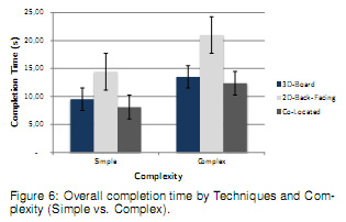
3D-Board is a device for remote whiteboard collaboration using multiple Microsoft Kinect sensors to make it appear that the remote collaborator is facing the user on the other side of a glass wall or transparent display. The researchers ran a usability test comparing task completion times with this 3D-Board versus a similar remote board that showed the back of the collaborator on the board. They also compared it with two people working together in the same room on a single whiteboard.
Source
Zillner, J., Rhemann, C., Izadi, S., & Haller, M. (2014). 3D-Board: A Whole-body Remote Collaborative Whiteboard. In Proceedings of the 27th Annual ACM Symposium on User Interface Software and Technology (pp. 471–479). New York, NY, USA: ACM. http://dx.doi.org/10.1145/2642918.2647393
Key Finding
The usability test with 12 participants showed users completed complex tasks faster with this 3D-Board than the back-facing design, a board that showed the back of the collaborator on the screen rather than the front. Using the 3D-Board was almost as fast as being in the same room.
Participants also rated the designs on 5-point Likert scales. Just over 90% of participants rated the 3D-Board as either easy or very easy to use, while 75% of participants rated the back-facing design as difficult or very difficult to use.
Design Implication
When designing large shared displays for remote collaboration, being able to see collaborators superimposed on the display can make it easier for teams to collaborate. But it works much better if users can see their collaborators facing forward rather than just seeing their backs.
This paper presents one way to achieve this aim. Two Microsoft Kinect sensors at the top left and top right of the display angled 45 degrees downwards can be used to render 3D images of collaborators and create an image of them facing forwards. The forward-facing images of collaborators the 3D-Board renders do appear somewhat distorted, but future innovations will likely improve the graphic fidelity of these images.
Concerns and Risks
This was a within-subjects controlled experiment with the order that participants saw the designs counterbalanced. This was a pretty solid way to design their study.
As the researchers point out, the back-facing design may not have worked as well because the body of the collaborator was blocking the target for the pointing task. This may have been a confounding factor. It may have been better for them to choose a different design to compare with their 3D-Board. At least they could make the collaborator's body look more transparent. This is the kind of problem that can be found and fixed with pilot testing.

- How Engaging Are Different On-Screen Website Controls?
- The mouse-over and drag controls were rated as more natural, intuitive, and easy to use by power users than by novice users, suggesting these controls require more practice.
- Users of the zoom control had lower ratings of absorption than users of the other 5 controls.
- Power users found the website more credible and likable when it used the mouse-over, click-to-download, and zoom controls. They also found the site using a 3D carousel less credible and disliked the sites with drag, slide, and 3D carousel controls.
- A memory test at the end of their study showed users of the slide controls were better able to remember the content of the website than users of the other controls, and users of the zoom controls remembered the content less well than the other groups.
- They also found that users of slide, click-to-download, and zoom controls remembered the pictures on the website better than users of the 3D carousel.
- If you are designing for memorability or learning, slide controls may be best. Users of slide controls remembered both content and pictures better than other users.
- If you are designing for power users, mouse-over may be the easiest and most engaging control, but novice users found it more difficult to use, less likable, and less credible. It must be made clear how to use the mouse-over controls, and delays between the mouse-over and the action should be avoided.
- If you are designing for novice users, avoid mouse-over and drag controls
- 3D carousels make websites look less credible and likeable to power users, but participants used them more times than any of the other controls.
- Companies With Better Customer Experiences Have Better Stock Performance
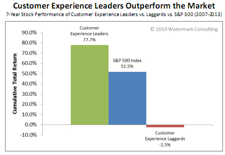
- The stocks of customer experience leaders performed much better than those of the customer experience laggards.
- The total return of customer experience leaders was 26 points higher than the S&P 500 from 2007-2013, while customer experience laggards performed worse than the S&P 500 for the same period.
Categories: IVR, Voice, Speech
Keywords: Interface design, in-vehicle speech interfaces, driving, emailing, distraction, driving simulator, text-to-speech, multiple voices, text complexity, task prioritization, user engagement
Synopsis
A study was run where participants used a driving simulator while using a speech interface to listen to and respond to emails. The experimenters varied whether or not the text-to-speech voices were matched with the gender of the senders and how complicated the emails were. Listening to emails did not affect driving performance, but speaking to compose a reply did make users drive worse.
Source
Truschin, S., Schermann, M., Goswami, S., & Krcmar, H. (2014). Designing interfaces for multiple-goal environments: Experimental insights from in-vehicle speech interfaces. ACM Transactions On Computer-Human Interaction, 21(1), 1-24. http://dx.doi.org/10.1145/2544066
Key Finding
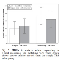
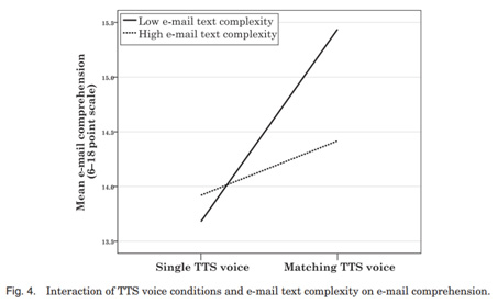
The authors found that making the voices more natural by matching the gender of the sender made the less complex emails easier to understand but made their driving performance worse. They thought that maybe the more natural voices were more engaging, which in turn distracted users from their main task of driving.
Another finding was that listening to emails did not make users' driving worse, but responding to those emails with speech did make them drive worse.
Design Implication
The most important implication is from their secondary finding that listening to messages did not make users' driving worse, but responding to those messages even with speech alone made users drive worse. So, in-vehicle speech interfaces could allow users to listen to messages during driving, but only allow users to reply when the vehicle has stopped. Some users may find this frustrating, so it may help to have this as a default setting that could be changed with an at-your-own-risk warning, and it would be important to make it clear to users that this design decision was to reduce distractions while they were driving.
The voices with genders matching the genders of the senders got mixed results - improved understanding of the more simple messages but worse driving performance. So changing voices may make for a more distracting interface, even if it makes it easier to understand less complex messages.
Concerns and Risks
Changing the voices of a speech interface to match the gender of the sender of the message made users drive worse when the messages were simple, even though they understood the messages more clearly with the matched voices.
But it's unclear what made the matching voices more distracting. Was it because the voices were more engaging or because just changing the voices was distracting?
Because there was not a control group with changing but not matching voices, their study didn't answer this question. The authors guessed that because users found the less complex messages easier to understand when the voices were matching that users were more engaged. But they did not measure engagement, so they didn't really show this was why the matching voices led to worse driving. It is also possible that having multiple different voices at all was simply more distracting, regardless of their gender.

Categories: Controlled Experiment, Visual & Graphic Design, Emotion, Persuasion
Keywords: Terror Management Theory, Advertising, Self-Esteem, Mood
Synopsis
A controlled experiment showed that advertisements that reminded customers of their mortality led to higher ratings of intent to purchase the advertised product. However, the size of the effect is at most one half of a point on a 7-point scale, and there may be unintended consequences to terrorizing customers.
Source
Das, E., Duiven, R., Arendsen, J., & Vermeulen, I. (2014). Exploring Killer Ads: A Terror Management Account of Death in Advertisements. Psychology & Marketing, 31(10), 828-842. http://dx.doi.org/10.1002/mar.20737
Key Finding
Participants who saw advertisements for a newspaper showing a funeral of a Dutch soldier and an advertisement for an art library showing a painting of a skull gave higher ratings of intention to purchase compared with a control group who saw similar advertisements without references to death. Intention to purchase was measured with 3 questions using 7-point Likert scales.
Their second and third studies showed that unconscious thoughts about death make this effect of death-related advertisements on purchase intentions work (mediate the effect). They used a word completion task to measure unconscious thoughts about death.
Design Implication
If you are trying to persuade people to purchase, it may help to include imagery and messaging that reminds people of their mortality - even if you are not selling life insurance. It does not have to be a death-related product or service to get this effect. However, the effect you get on intent to buy is quite small, and there may be other unintended consequences of reminding customers of their mortality (see Concerns and Risks below).
Concerns and Risks
Categories: Information Architecture
Keywords: search engine optimization, ranking algorithm, learning, information architecture
Synopsis
What factors most improve search ranking? In this study, the researchers tried to reengineer the search engine code of the two main search engine giants, Google and Bing, to get similar results. This code was then used to identify which factors had the biggest impact on search engine ranking.
Source
Su, A.-J., Hu, Y. C., Kuzmanovic, A., and Koh, C.-K. (2014). How to improve your search engine ranking: Myths and reality. ACM Trans. Web 8, 2, Article 8 (March 2014), 25 pages. http://dx.doi.org/10.1145/2579990
Key Finding
Design Implication
Concerns and Risks
Because they were working off their own model rather than beginning with an exploratory study, it is possible there are factors they did not include in their model that may have had an impact on search engine rankings. Still, a model with about 80% accuracy is not bad.
Categories: Controlled Experiment, Interaction Design, Handheld & Mobile, Touch Screen
Keywords: Smartphones, Mobile, Scrolling, Flick, Ring
Synopsis
This was a detailed study of two scrolling techniques, flicking in a line versus making a circle using three input methods (index finger, pen, or thumb), and in two body positions (walking and sitting). The authors measured movement time and the number of times the user scrolled past the target before selecting it. Flick was faster, had less scrolling past the target, and was rated higher than scrolling with a ring, with a few exceptions.
Source
Tu, H., Ren, X., Tian, F. & Wang, F. (2014). Evaluation of Flick and Ring Scrolling on Touch-Based Smartphones. International Journal of Human-Computer Interaction, 30(8), 643-653. http://dx.doi.org/10.1080/10447318.2014.907017
Key Finding
Drawing a straight line (flick scrolling) was faster, had less scrolling past the target, and was rated higher than scrolling with a ring, with a few exceptions. When scrolling more than 200 lines, ring scrolling was faster. Participants also preferred using ring scrolling with their thumb, likely because it was physically more difficult to draw a straight line with their thumbs.
Design Implication
Use flick scrolling to scroll on mobile smartphones, and for longer lists provide a scroll bar on the right to "jump" farther down the list. Ring scrolling may make it easier to quickly "jump" in this way, but it reduces speed and accuracy once you get closer to your target. The authors also suggest that advances in smooth or "inertial" scrolling may improve ring scrolling, though this was not explored in their study.
Concerns and Risks
This was a solid study with objective measures. They managed to get statistical significance with 10 participants.
9 of the 10 participants were male, so if there are gender differences it may be worth replicating this study. It would have been better if they had something closer to 5 female and 5 male participants.
They used the same participants for Experiment 2 that they used for Experiment 1, which has the benefit of making it easier to compare across the experiments. They controlled for learning effects by dropping the first phase of each experiment, effectively making it a "practice run" or training period.
Categories: Controlled Experiment, Interaction Design, Enjoyment & Flow
Keywords: Controls, Engagement, Absorption, Structural Equation Modeling
Synopsis
An experimental study compared user perceptions of 6 controls: click-to-download, drag, mouse-over, slide, zoom, and 3D carousel. 128 participants were randomly assigned to use a website with one of the 6 controls, so there were 21-22 participants in each condition.
Participants were instructed to explore the site and learn as much as they could about the information on the site. Then they rated the ease of use, intuitiveness, and degree of natural mapping of the controls on 7-point Likert scales. They also used a 12-question measure of how much they were power-users as a moderating variable.
User engagement was measured by logging the number of times the participant used the given control with their mouse. Absorption was measured with a 3-question measure with questions about time appearing to go by quickly, losing track of time, or spending more time on the content than intended.
Source
Sundar, S. S., Bellur, S., Oh, J., Xu, Q., & Jia, H. (2014). User Experience of On-Screen Interaction Techniques: An Experimental Investigation of Clicking, Sliding, Zooming, Hovering, Dragging, and Flipping. Human–Computer Interaction, 29(2), 109–152. http://dx.doi.org/10.1080/07370024.2013.789347
Key Finding
Design Implication
Concerns and Risks
This was a very solid experimental design with random assignment to the 6 different conditions. Other than the controls being different, the content and layout of the website prototypes were the same across all 6 experimental conditions.
The number of times a control was used was not a great measure of user engagement. They found that users used the mouse-over and 3D carousel more times than the other controls. But, as the researchers point out, this could just be because these controls were harder to use rather than because they were more engaging. There is no way to tell from just this behavioral data.
It may have been easier for the researchers to say something interesting with their measure of absorption if they had some baseline for comparing the measures of absorption they found, such as a control group. Also, it may have been easier for them to draw conclusions about how engaging the controls were if they included a measure of user enjoyment rather than just how much time seemed to fly by.
Categories: Management of User Experience
Keywords: Return on Investment, Customer Experience, Stock Performance
Synopsis
The researchers used Forrester's Customer Experience Index, which rates how well companies do customer experience, and compared the stock performance of the top ten customer experience leaders with the bottom ten customer experience laggards.
Source
Picoult, J. (2014). Watermark Consulting’s 2014 Customer Experience ROI Study. http://bit.ly/CX-ROI
Key Finding
Design Implication
This is further ammunition for when we need to make the business case for user experience work. When we're communicating with clients focused on the bottom line, we can point to these numbers.
Concerns and Risks
This was a kind of correlation study. (Technically, it's a quasi-experiment.) So, it is important to remember that correlation does not equal causation. Just because customer experience ratings are related with stock performance does not necessarily mean better customer experience ratings caused better stock performance. But correlations may be the best anyone can do to get at these kind of organization-level questions. It's not really feasible to randomly assign whole companies to be customer experience leaders and laggards for a controlled experiment.
Also, it may have been better if they used linear regression with all the data because they would have been using more than just the top and bottom 10 companies.
- Safety and Multi-tasking With In-Vehicle Speech Interfaces Truschin, S., Schermann, M., Goswami, S., & Krcmar, H. (2014). Designing interfaces for multiple-goal environments: Experimental insights from in-vehicle speech interfaces. ACM Transactions On Computer-Human Interaction, 21(1), 1-24. http://dx.doi.org/10.1145/2544066
- Reminders of Mortality Make Customers Want to Buy Das, E., Duiven, R., Arendsen, J., & Vermeulen, I. (2014). Exploring Killer Ads: A Terror Management Account of Death in Advertisements. Psychology & Marketing, 31(10), 828-842. http://dx.doi.org/10.1002/mar.20737
- What five factors most improve search engine ranking? Su, A.-J., Hu, Y. C., Kuzmanovic, A., and Koh, C.-K. (2014). How to improve your search engine ranking: Myths and reality. ACM Trans. Web 8, 2, Article 8 (March 2014), 25 pages. http://dx.doi.org/10.1145/2579990
- Flick Versus Ring Scrolling on Smartphones Tu, H., Ren, X., Tian, F. & Wang, F. (2014). Evaluation of Flick and Ring Scrolling on Touch-Based Smartphones. International Journal of Human-Computer Interaction, 30(8), 643-653. http://dx.doi.org/10.1080/10447318.2014.907017
- Front-Facing 3D-Board Enhances Remote Collaboration Zillner, J., Rhemann, C., Izadi, S., & Haller, M. (2014). 3D-Board: A Whole-body Remote Collaborative Whiteboard. In Proceedings of the 27th Annual ACM Symposium on User Interface Software and Technology (pp. 471–479). New York, NY, USA: ACM. http://dx.doi.org/10.1145/2642918.2647393
- How Engaging Are Different On-Screen Website Controls? Sundar, S. S., Bellur, S., Oh, J., Xu, Q., & Jia, H. (2014). User Experience of On-Screen Interaction Techniques: An Experimental Investigation of Clicking, Sliding, Zooming, Hovering, Dragging, and Flipping. Human–Computer Interaction, 29(2), 109–152. http://dx.doi.org/10.1080/07370024.2013.789347
- Companies With Better Customer Experiences Have Better Stock Performance
Picoult, J. (2014). Watermark Consulting’s 2014 Customer Experience ROI Study. http://bit.ly/CX-ROI
Message from the CEO, Dr. Eric Schaffer — The Pragmatic Ergonomist
Leave a comment here
Subscribe
Sign up to get our Newsletter delivered straight to your inbox
Privacy policy
Reviewed: 18 Mar 2014
This Privacy Policy governs the manner in which Human Factors International, Inc., an Iowa corporation (“HFI”) collects, uses, maintains and discloses information collected from users (each, a “User”) of its humanfactors.com website and any derivative or affiliated websites on which this Privacy Policy is posted (collectively, the “Website”). HFI reserves the right, at its discretion, to change, modify, add or remove portions of this Privacy Policy at any time by posting such changes to this page. You understand that you have the affirmative obligation to check this Privacy Policy periodically for changes, and you hereby agree to periodically review this Privacy Policy for such changes. The continued use of the Website following the posting of changes to this Privacy Policy constitutes an acceptance of those changes.
Cookies
HFI may use “cookies” or “web beacons” to track how Users use the Website. A cookie is a piece of software that a web server can store on Users’ PCs and use to identify Users should they visit the Website again. Users may adjust their web browser software if they do not wish to accept cookies. To withdraw your consent after accepting a cookie, delete the cookie from your computer.
Privacy
HFI believes that every User should know how it utilizes the information collected from Users. The Website is not directed at children under 13 years of age, and HFI does not knowingly collect personally identifiable information from children under 13 years of age online. Please note that the Website may contain links to other websites. These linked sites may not be operated or controlled by HFI. HFI is not responsible for the privacy practices of these or any other websites, and you access these websites entirely at your own risk. HFI recommends that you review the privacy practices of any other websites that you choose to visit.
HFI is based, and this website is hosted, in the United States of America. If User is from the European Union or other regions of the world with laws governing data collection and use that may differ from U.S. law and User is registering an account on the Website, visiting the Website, purchasing products or services from HFI or the Website, or otherwise using the Website, please note that any personally identifiable information that User provides to HFI will be transferred to the United States. Any such personally identifiable information provided will be processed and stored in the United States by HFI or a service provider acting on its behalf. By providing your personally identifiable information, User hereby specifically and expressly consents to such transfer and processing and the uses and disclosures set forth herein.
In the course of its business, HFI may perform expert reviews, usability testing, and other consulting work where personal privacy is a concern. HFI believes in the importance of protecting personal information, and may use measures to provide this protection, including, but not limited to, using consent forms for participants or “dummy” test data.
The Information HFI Collects
Users browsing the Website without registering an account or affirmatively providing personally identifiable information to HFI do so anonymously. Otherwise, HFI may collect personally identifiable information from Users in a variety of ways. Personally identifiable information may include, without limitation, (i)contact data (such as a User’s name, mailing and e-mail addresses, and phone number); (ii)demographic data (such as a User’s zip code, age and income); (iii) financial information collected to process purchases made from HFI via the Website or otherwise (such as credit card, debit card or other payment information); (iv) other information requested during the account registration process; and (v) other information requested by our service vendors in order to provide their services. If a User communicates with HFI by e-mail or otherwise, posts messages to any forums, completes online forms, surveys or entries or otherwise interacts with or uses the features on the Website, any information provided in such communications may be collected by HFI. HFI may also collect information about how Users use the Website, for example, by tracking the number of unique views received by the pages of the Website, or the domains and IP addresses from which Users originate. While not all of the information that HFI collects from Users is personally identifiable, it may be associated with personally identifiable information that Users provide HFI through the Website or otherwise. HFI may provide ways that the User can opt out of receiving certain information from HFI. If the User opts out of certain services, User information may still be collected for those services to which the User elects to subscribe. For those elected services, this Privacy Policy will apply.
How HFI Uses Information
HFI may use personally identifiable information collected through the Website for the specific purposes for which the information was collected, to process purchases and sales of products or services offered via the Website if any, to contact Users regarding products and services offered by HFI, its parent, subsidiary and other related companies in order to otherwise to enhance Users’ experience with HFI. HFI may also use information collected through the Website for research regarding the effectiveness of the Website and the business planning, marketing, advertising and sales efforts of HFI. HFI does not sell any User information under any circumstances.
Disclosure of Information
HFI may disclose personally identifiable information collected from Users to its parent, subsidiary and other related companies to use the information for the purposes outlined above, as necessary to provide the services offered by HFI and to provide the Website itself, and for the specific purposes for which the information was collected. HFI may disclose personally identifiable information at the request of law enforcement or governmental agencies or in response to subpoenas, court orders or other legal process, to establish, protect or exercise HFI’s legal or other rights or to defend against a legal claim or as otherwise required or allowed by law. HFI may disclose personally identifiable information in order to protect the rights, property or safety of a User or any other person. HFI may disclose personally identifiable information to investigate or prevent a violation by User of any contractual or other relationship with HFI or the perpetration of any illegal or harmful activity. HFI may also disclose aggregate, anonymous data based on information collected from Users to investors and potential partners. Finally, HFI may disclose or transfer personally identifiable information collected from Users in connection with or in contemplation of a sale of its assets or business or a merger, consolidation or other reorganization of its business.
Personal Information as Provided by User
If a User includes such User’s personally identifiable information as part of the User posting to the Website, such information may be made available to any parties using the Website. HFI does not edit or otherwise remove such information from User information before it is posted on the Website. If a User does not wish to have such User’s personally identifiable information made available in this manner, such User must remove any such information before posting. HFI is not liable for any damages caused or incurred due to personally identifiable information made available in the foregoing manners. For example, a User posts on an HFI-administered forum would be considered Personal Information as provided by User and subject to the terms of this section.
Security of Information
Information about Users that is maintained on HFI’s systems or those of its service providers is protected using industry standard security measures. However, no security measures are perfect or impenetrable, and HFI cannot guarantee that the information submitted to, maintained on or transmitted from its systems will be completely secure. HFI is not responsible for the circumvention of any privacy settings or security measures relating to the Website by any Users or third parties.
Correcting, Updating, Accessing or Removing Personal Information
If a User’s personally identifiable information changes, or if a User no longer desires to receive non-account specific information from HFI, HFI will endeavor to provide a way to correct, update and/or remove that User’s previously-provided personal data. This can be done by emailing a request to HFI at hfi@humanfactors.com. Additionally, you may request access to the personally identifiable information as collected by HFI by sending a request to HFI as set forth above. Please note that in certain circumstances, HFI may not be able to completely remove a User’s information from its systems. For example, HFI may retain a User’s personal information for legitimate business purposes, if it may be necessary to prevent fraud or future abuse, for account recovery purposes, if required by law or as retained in HFI’s data backup systems or cached or archived pages. All retained personally identifiable information will continue to be subject to the terms of the Privacy Policy to which the User has previously agreed.
Contacting HFI
If you have any questions or comments about this Privacy Policy, you may contact HFI via any of the following methods:
Human Factors International, Inc.
PO Box 2020
1680 highway 1, STE 3600
Fairfield IA 52556
hfi@humanfactors.com
(800) 242-4480
Terms and Conditions for Public Training Courses
Reviewed: 18 Mar 2014
Cancellation of Course by HFI
HFI reserves the right to cancel any course up to 14 (fourteen) days prior to the first day of the course. Registrants will be promptly notified and will receive a full refund or be transferred to the equivalent class of their choice within a 12-month period. HFI is not responsible for travel expenses or any costs that may be incurred as a result of cancellations.
Cancellation of Course by Participants (All regions except India)
$100 processing fee if cancelling within two weeks of course start date.
Cancellation / Transfer by Participants (India)
4 Pack + Exam registration: Rs. 10,000 per participant processing fee (to be paid by the participant) if cancelling or transferring the course (4 Pack-CUA/CXA) registration before three weeks from the course start date. No refund or carry forward of the course fees if cancelling or transferring the course registration within three weeks before the course start date.
Cancellation / Transfer by Participants (Online Courses)
$100 processing fee if cancelling within two weeks of course start date. No cancellations or refunds less than two weeks prior to the first course start date.
Individual Modules: Rs. 3,000 per participant ‘per module’ processing fee (to be paid by the participant) if cancelling or transferring the course (any Individual HFI course) registration before three weeks from the course start date. No refund or carry forward of the course fees if cancelling or transferring the course registration within three weeks before the course start date.
Exam: Rs. 3,000 per participant processing fee (to be paid by the participant) if cancelling or transferring the pre agreed CUA/CXA exam date before three weeks from the examination date. No refund or carry forward of the exam fees if requesting/cancelling or transferring the CUA/CXA exam within three weeks before the examination date.
No Recording Permitted
There will be no audio or video recording allowed in class. Students who have any disability that might affect their performance in this class are encouraged to speak with the instructor at the beginning of the class.
Course Materials Copyright
The course and training materials and all other handouts provided by HFI during the course are published, copyrighted works proprietary and owned exclusively by HFI. The course participant does not acquire title nor ownership rights in any of these materials. Further the course participant agrees not to reproduce, modify, and/or convert to electronic format (i.e., softcopy) any of the materials received from or provided by HFI. The materials provided in the class are for the sole use of the class participant. HFI does not provide the materials in electronic format to the participants in public or onsite courses.


